Header toolbar buttons
The header toolbar buttons includes several buttons that may be included by the shiny app developer to help improve the user experience of the card panel. These buttons include -
- Header title edit button
- Header background color button
- Card panel collapse button
- Card panel close button
- Card panel fullscreen button
Example shiny app card.pro panel

Edit button
The edit button can be enabled using the card.pro() function to show the pen icon, which allows the user to click and edit the title of the card panel. When the edit icon is clicked, a text input appears below the header, allowing the user to edit the text. When the user is finished, the user MUST click the save icon to save the header title.
The user may set the edit button to show using the code below
Below is an example screenshot of what the text input looked like.

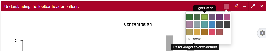
Background color
The background color button allows the user to easily change the background color of the card header to suit their preference. Upon refresh, their chosen header color is retained.
The user may set the background color chooser button to show using the code below
Below is an example screenshot of what the color chooser input looks like when clicked.
Panel collapse
The panel collapse button allows the user to be able to collapse the panel while using the shiny app. This button may be enabled/disabled by the user.
The user may set the collapse button to show or hide using the code below
Please note that the purpose of the collapsed argument is different from the purpose of the expandbtn argument. The first argument chooses if the panel is collapsed when the app is launched. The latter shows/hides the “+” or “-” in the header for use in collapsing or uncollapsing the panel while the shiny app is in use.
Below is an example screenshot to show what button corresponds to this action -

Panel full screen
Full screen is incredibly useful when the shiny app has multiple panels. Sometimes, the user really needs the content of a panel to be enlarged within the same screen. This feature is provided by the full screen button, which the developer may enable/disable. By default, it is enabled within the card.pro function.
Nonetheless, the user may set the full screen button to hide/show using the code below
Below is an example screenshot to show what button corresponds to this action -

Panel close
Panel close button allows the user of the shiny app to close a panel within a session. This means that when the browser is refreshed, the closed panel will reappear. This feature is not saved across sessions to avoid the loss of content by the user. More so, the feature allow with other toolbar buttons, when altered are user independent.
The user may set the close button to hide/show using the code below
Below is an example screenshot to show what button corresponds to this action -
